Deviation Actions


Description
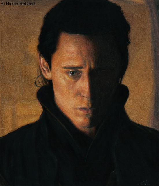
I don't know why, but at the moment I'm very uninspired and not in the mood to draw something new (besides Loki?).
 The fact that my scanner hates me doesn't make it better... My scanner just hates to scan very dark/black parts and in the end everything is messed up. I think it was a bad decision to start another very dark drawing (I just wanted to draw a very dark picture as a challenge...).
Reference was a screencap of Loki (Tom Hiddleston) from a deleted scene of the movie "Thor" (2011).
Paper DIN A4 190g/m² (size of the drawing = 11,6cm x 13,6cm); Faber-Castell Polychromos artists' colour pencils, Copic Ciao marker, uni-ball Signo pigment ink um-153 white; time: ~4h
Please don't upload my pictures somewhere else without my permission. Don't infringe copyright!
Here some other traditional Loki drawings:


I think you did a good job at drawing a dark piece the traditional way too, perhaps it would have been easier with the inversion method, but this still looks good. I don’t know how much it’s you and how much it’s the reference, but I like how his eye appear blue (I guess it’s really drawn with grey pencil though) while the rest of the scene is soaked in yellow hues.
I commented about a white section at the top of a previous image. I think something similar happened here. I think you could have left out the darker streak to the right side of the image, keeping it a lighter brown/orange/yellow. Though thinking further about it I realize that it would make for a rather different picture. If the dark area was removed it would look more like a portrait, a construct. Here there is a hint of a real background, making it a scene that can be taken out of reality. Amazing how such small things can change a whole drawing.